Developing an identity for IDEO’s studio focused on innovation in the health industry.
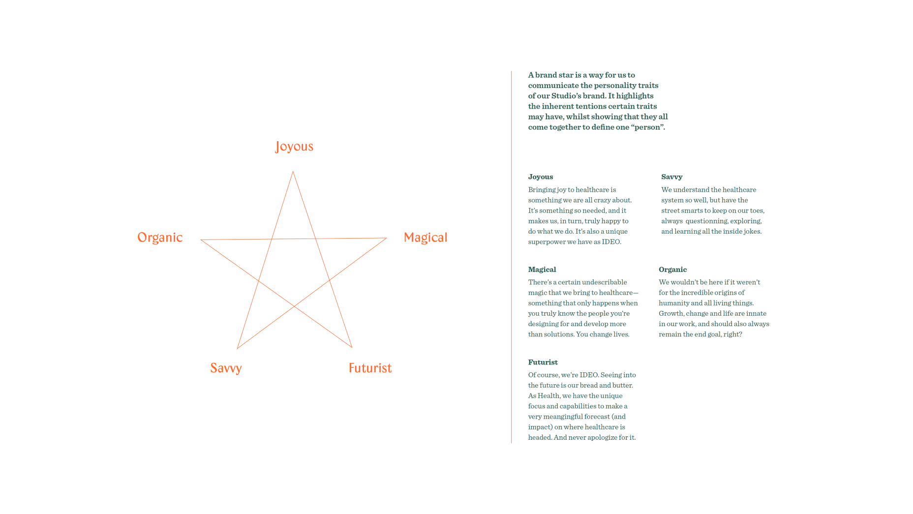
IDEO has been doing globally impactful work in the healthcare space for decades—work with many different areas of focus. Once the pandemic hit, the group of designers leading this effort realized it was time to convene around a shared purpose, that of “Bringing dignity, equity and joy to all”. With this new north star, it was a prime moment to design a bold new visual identity—one that would communicate our values internally to employees, and externally to our clients.
The Solution
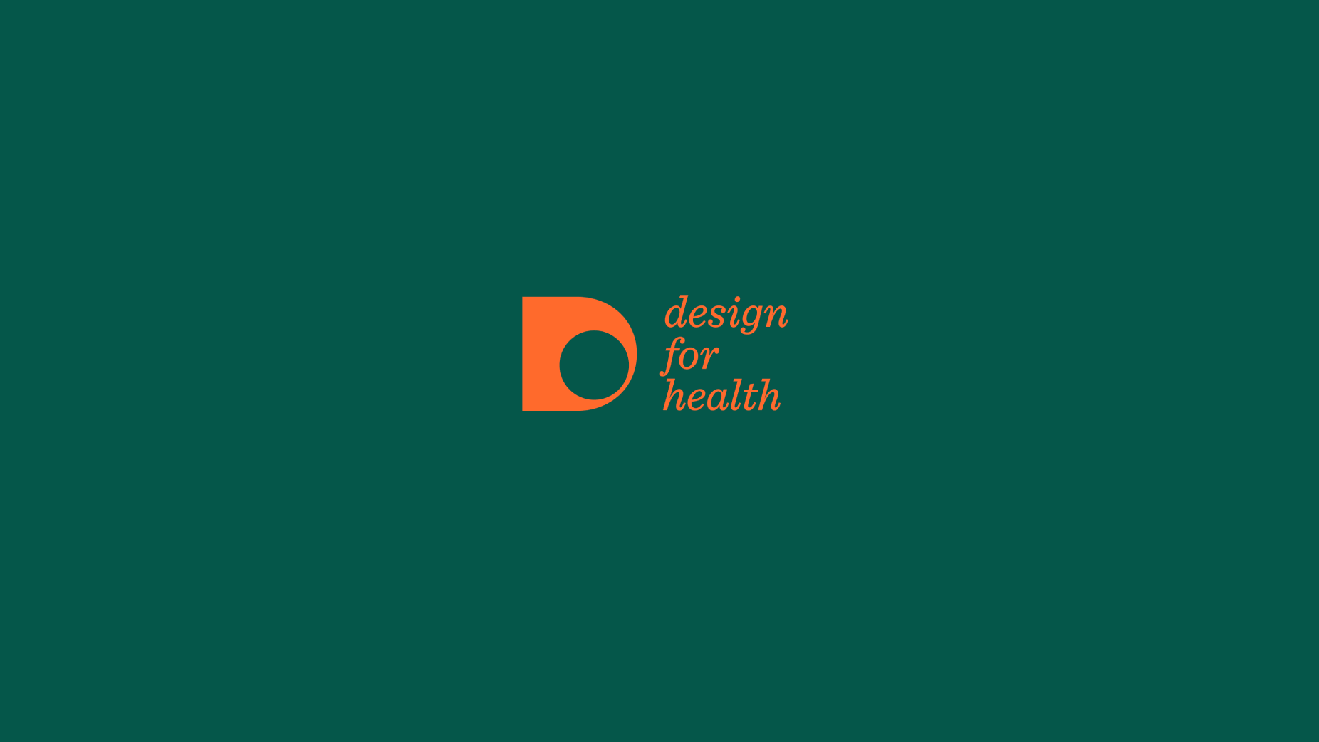
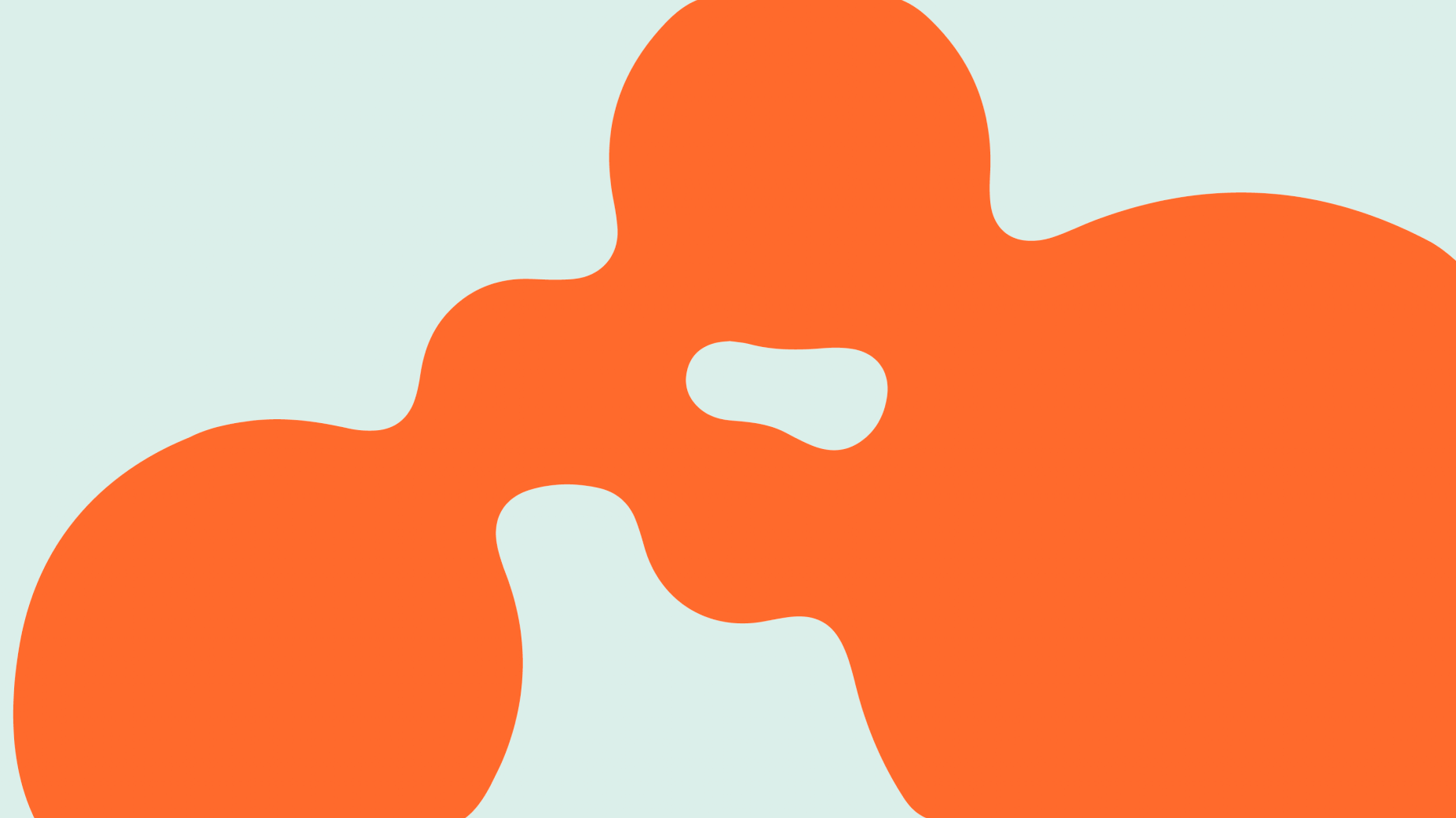
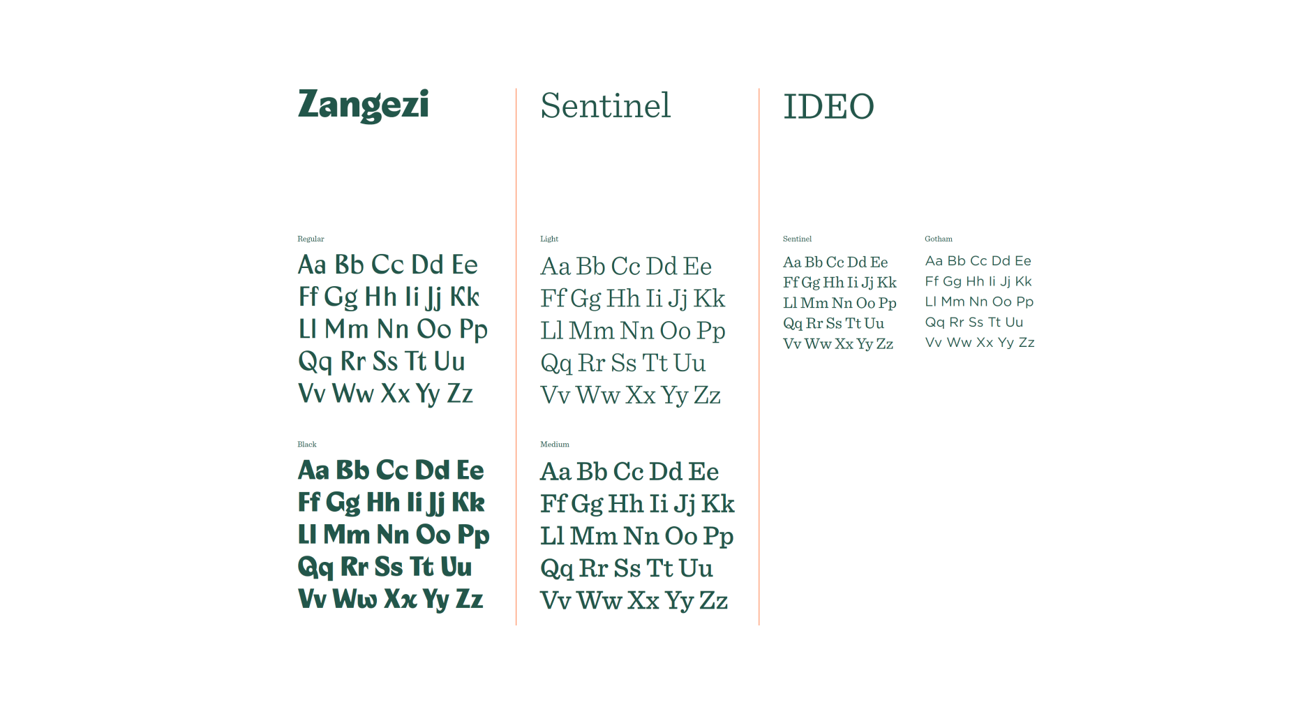
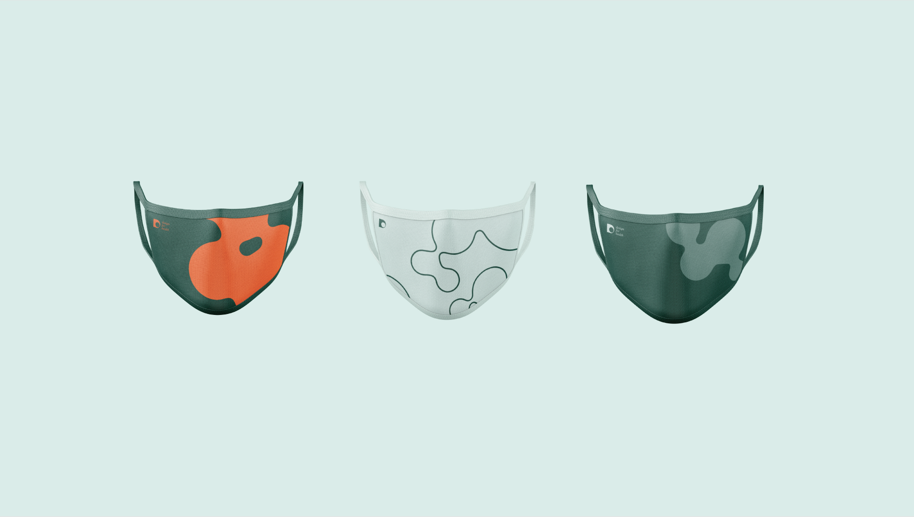
A visual identity for IDEO’s Design for Health studio, consisting of a brand mark and employee and client-facing digital and physical assets. The brand concept centered around the “Cell.” A symbol that stands for life and potential, all life begins with cells—and grows into the people the studio serves, the forces that affect them, and the nature that heals them. This basic round cell shape is able to morph when applied to different assets, representing this growth and change.
My Role
Consulting with the studio’s leadership team, I lead ideation, sketching and execution of brand personality, identity concept and artwork, partnering with a fellow communication designer on final execution of brand guidelines and application across assets.